Survival Curves: The A/B Testing Tool Most Teams Ignore
Why “no lift” often means “you’re not looking closely enough”
Most A/B tests end the same way.
A slide.
One number.
A conclusion that sounds like:
“Conversion was flat. No meaningful difference.”
If you’ve been running experiments for more than a couple of years, you know that conclusion is often wrong. Not technically wrong. Just incomplete.
Some of the most important behavior changes never show up in a final conversion rate. They show up in how long users hesitate, wait, or drop out before anything happens.
That’s what survival curves are good at surfacing.
The blind spot in most experimentation programs
Traditional A/B testing answers a narrow question:
Did Variant B convert more users than Control?
That works fine when decisions are instant. It breaks down when users:
Hesitate
Compare options
Leave and come back
Drop off mid-flow
Delay action across sessions
Most real product changes affect decision timing, not just outcomes.
If all you measure is the endpoint, you miss the behavior change entirely.
What a survival curve actually shows
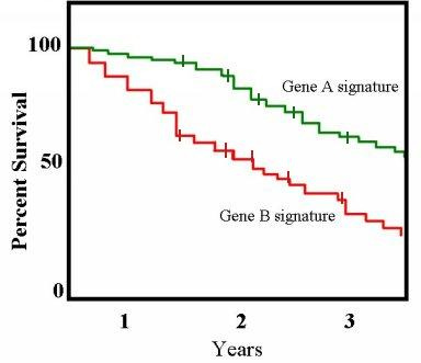
A survival curve plots the percentage of users who have not yet experienced a defined event at each point in time.
The event can be anything, but it must be precise:
Conversion
Funnel abandonment
Churn
First meaningful action
The mechanics are simple:
The curve starts at 100 percent
It stays flat when nothing happens
It steps downward when users hit the event
It never goes up
Each curve represents a cohort, usually control vs test.
(Image Source: wikipedia.org)
Despite the name, there’s nothing morbid about it. It’s just borrowed statistical language.
How to read survival curves without overcomplicating it
Two rules cover most interpretations:
A higher curve means more users have not yet hit the event
A steeper drop means the event is happening faster
Whether “faster” is good or bad depends entirely on the event.
If the event is conversion:
Faster can be good
If the event is churn or abandonment:
Faster is bad
What matters most is where and how the curves separate.
Patterns I see regularly in real tests:
Early separation, then convergence
The test changed hesitation, not intentTest drops faster early
Reduced friction or clearer decision-makingTest stays higher longer
Added cognitive load or uncertaintyCurves separate and never reunite
Strong behavioral difference, even if final conversion is flat
This is usually where product teams say, “Something feels off,” while dashboards say everything is fine.
Why conversion rate alone hides these effects
Two variants can end with the same conversion rate and still deliver very different experiences.
Example I’ve seen more times than I can count:
Control converts slowly but steadily
Test converts faster early, then levels off
Final conversion is identical.
But users:
Decide sooner
Need fewer sessions
Spend less time stuck
Reach value faster
If you only report conversion rate, the test looks like a wash.
If you look at survival curves, you see a meaningful behavioral shift.
The technical reason analysts care about this
At the end of any experiment, a large share of users:
Haven’t converted yet
Haven’t churned yet
Are still mid-flow
Those users aren’t failures. They’re unfinished.
Standard metrics quietly mishandle this. Survival analysis doesn’t. It treats those users as censored rather than misclassified.
That’s especially important in:
Long onboarding flows
Subscription products
High-consideration purchases
Fixed-length experiments
One important caveat: survival analysis assumes censoring isn’t systematically tied to the event. In product data, that’s not always true. You still need judgment.
A quick note on the statistics
Most survival curves in experimentation use:
Kaplan–Meier estimation to draw the curves
Log-rank tests to compare them
The log-rank test works best when the curves don’t cross too much. If they do, that’s not a failure. It’s a signal that the effect changes over time and needs closer inspection.
The key point isn’t the test itself. It’s the question being asked:
Not “Did conversion go up?”
But “Did the timing of user behavior change?”
Those are different questions.
When survival curves are worth using
I don’t recommend them for every experiment.
They’re most useful when:
Users can pause, hesitate, or abandon
The flow has multiple steps
The test changes clarity, trust, or complexity
Conversion rate alone feels unsatisfying
They add little value when:
The action is instantaneous
Traffic is extremely low
Timing is irrelevant to the decision
A simple rule I use:
If users can think, timing matters.
If timing matters, survival curves help.
Why this matters as programs mature
Early experimentation programs fail on statistics.
Mature programs fail on interpretation.
Teams ship:
Extra explanation that slows decisions
Friction that looks “safe” but adds drag
UX changes that increase hesitation
And the dashboard says everything is fine.
Survival curves expose that gap. Not perfectly. But far better than a single end-state metric.
The takeaway
Survival curves don’t replace conversion rate. They complete it.
Conversion tells you what happened.
Survival curves show how it happened over time.
If you’ve ever felt uneasy shipping a “flat” test, this is probably why.


